« Complexity leads to simplicity |
Main
| Fitting in with triads »
 May 31, 2012 | Photographing Mandolins May 31, 2012 | Photographing Mandolins
In lieu of the announcement of recent changes at the MandolinCafe Classifieds, we thought we'd resurrect our September 2006 Tips & Tricks column from the archives on Photographing mandolins. Happy Shooting!

A look at composition; or a composition of "look?"
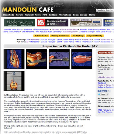
If you ever plan to sell a mandolin on-line or just want to document your prize possession for posterity, it might be good to review several tips on optimal digital photography. Most of these are simple common sense, but if you've never thought about how to present your instrument effectively, these points are worth considering.
Lighting. There's nothing better under the sun than well.. the sun. Natural sunlight brings the best out of color and is far less expensive than a sophisticated set-up of lights and flash equipment. (Get your priorities straight; such money should be spent on more mandolins, after all.)
You probably want to avoid direct sunlight, unless you're capturing an intense wood flame, but you do so at the risk of glare and overexposure. It doesn't even have to be a completely sunny day, and if it is, shade would probably be recommended.
Content. Several viewpoints are no-brainers, but you want to capture the best of your instrument. The obligatory "full-body" shots, BOTH front and back are necessary, but consider wide frame shots of the back and top, especially if the wood and its flame are something you are proud of.
Don't forget the finer points, close ups of the tailpiece, bouts and points, bridge, headstock (front AND back), any special inlays or binding, the fretboard, and the back of the neck. If your camera has enough resolution, these shots can dazzle the viewer. Go through the list and don't be afraid to experiment with odd angles. The trick of good photography is not what you keep; it's what you throw away. Shoot about 10 times the pictures you actually use (maybe more!); ridding yourself of the bad ones are as close as your "Recycle" icon on your computer desktop. Leave nothing to chance, as what you see in the camera can be different from what you'll see on the computer monitor.
Edit. Most digital cameras come with a software editing program. The beauty of digital photography is right here, the ability to crop, darken, lighten, or alter the hue. We once took pictures of some beautiful instruments under very unfortunate trade show fluorescent lighting. All the reds were robbed, and it was a simple matter of adjusting the hue in the software to bring them back to reality. Don't overdo this, however, the goal is to make the picture as lifelike as possible.
We recommend keeping your pictures under 600 pixels high and wide for web viewing, preferably under 100K and 72 dpi to give Luddite web-surfers on slow speed or dial-up the opportunity for quicker access. (Some people still use computers made in the last century, powered by coal.) You can certainly have larger size and greater resolution, but these are better sent directly or accessed through a URL for offline scrutiny.
Background. If you want to show the instrument, be sensitive to the background, as well. Avoid content that might detract from the instrument, a solid background. If you want to pull the color out of the instrument, use a contrasting, but non-distracting color. For example, if you want to pull a red hue out of your instrument, a light mint color behind will make this tint leap off the screen.
A piano salesman trick--suggestive selling. A savvy salesperson will plant the thought of owning a piano in the head of a potential customer by asking "Which room will this piano be in?" The purpose of the question is a sly one; going through the mental exercise of putting an object in the home is one step closer to ownership. That said, you can place background content in your picture (if it is to be an advertisement) that subliminally offers "homey-ness." Confession: we've been guilty of using fireplaces, front porch, dogs, and small children to make the instrument "real."
If you opt for additional content in the background, be sensitive to color. You can use contrasting color or find things in the background that are colors in your instrument that bring them out. Flowers that match the inlay or pickguard color, we've even seen bottles of fine whiskey effectively used in the background to complement finish. (Talk about suggestive selling!...)
This can be fun and you'll only get better as you shoot more pictures over the years.
Further:
The Basics of Auditioning Instruments
Variables
Tips for shipping mandolins
Judging builders
Jupiter Silkweave Cloth
Posted by Ted at May 31, 2012 5:40 AM

Disclaimer: In the 'Information Age' of the 21st Century,
any fool with a computer, a modem, and an idea can
become a self-professed 'expert." This site does not
come equipped with 'discernment.'
|


